
January 10th, 2007
Ed Ruscha
Up to the 22nd of January, the Norton Simon Museum will house an exhibition featuring Ed Ruscha’s works, called “Ooo: Early Prints by Ed Ruscha“.

The exhibition covers the period in which he produced a series of oils on canvas with nothing (or almost nothing) more than words painted as if they were liquids. The work was developed from 1966 to 1969, and can be seen more fully on this excellent and complete official site/catalog. The paintings shown here are a small sample of the amazing things which can be found there. His work with colour is really interesting and the technique used to portray liquids is so good that it is actually scary.

According to Artforum:
During his two-month fellowship at Los Angeles’s Tamarind Lithography Workshop in 1969, Ed Ruscha cultivated his “liquid word” images, a theme he had developed through paintings three years earlier. These images, sometimes based on arrangements he staged in the studio, present short, often monosyllabic words, like EYE and AIR, figured as splotches of liquid on flat fields of color. Fourteen of these works, on view in this exhibition, evince Ruscha’s technical knack for graphic art while marking both his attention to language and his unmistakably American sense of humor.

The most interesting thing to me was finding out that so far back there was already a work developed which could be considered contemporary art and also dealt with type design. I acknowledge that it is closely related to Pop Art (which was interested in type studies), but even the popular stuff which was made then did not have this aspect. And more, most of the type design being made was regarded simply as design, not art. Another thing worth mentioning is how the aesthetic of Ruscha’s work is worthy of what designers are trying to achieve today using computers, especially ‘real’ textures that can fake intricate objects, some so intricate that would require a great deal of work to be actually made (despite the fact that the virtual counterparts are very hard to achieve as well). There’s been a great deal of advance in computer graphics (especially 3D) which point to a return to (and incorporation of) an organic feel through the improvement of mechanical techniques.
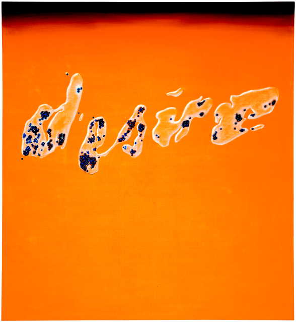
Another thing is the proximity established by him with questions posed by linguistics, such as the relations between sign, signifier and signified; so subtly inherent to the images that can easily be overlooked. There are also some other aspects which we, who will only see these low quality images on a computer display, won’t admire: apparently Ruscha was very keen on detail (and that is easily seen on the paintings), which led him to add some small elements to them (flies, dirt, particles and other small bodies) both enlarging the significance space and adding a comic relief to his simple and complex works.
Other links
The ‘National Gallery of Art‘ in Washington has a detailed (21 pages long) discussion on another version of “Lisp”; which, by the way, can be compared to this edition of the Globe Magazine, dating back to 1937!
Another intersting organic-feel type design work is the one done by Ralph Steadman to illustrate Hunter S. Thompson‘s “The Curse of Lono“.
The series “Things I learned in my life so far” by Stefan Sagmeister (an important figure in the world of graphic design) also features some interesting type design.
Filed by rhwinter at January 10th, 2007 under art, painting, type
5 persons have commented this post