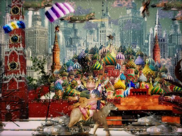
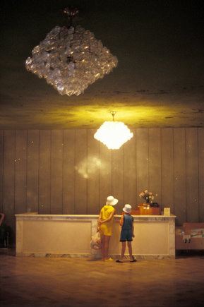
Probably the best videoclip I’ve seen in years (for more than one reason). The band playing is Lyapis Trubetskoy (or Ляпис Трубецкой) and it is from Belarus! (the official website seems to be down, which prevents us from knowing much more about him/them/etc.).
- Get the average quality quicktime here
- Watch on youtube (not even worth it if you ask me)
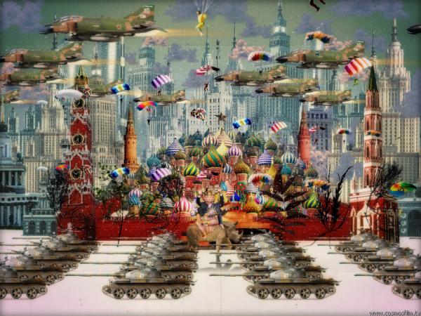
Even more images here, in case you’re not convinced yet!
The guys who made it claim to have invented bullet-time. Mad-genious kind of people. Their website in russian or english (what I watched there doesn’t even come near to this videoclip).
Oh, and I have no idea what the lyrics are saying, but I’ll find out, anyway these are pretty in-your-face:

According to a youTube comment the lyrics are:
I dine
Gold bars
Diamond for dessert
Oil cream
My name is Beelzebub
Master of the Stratosphere
I’m realy cool
Respect to me infinity
On the left hand Snickers
On the right hand Mars
My PR manager is Carl Marx
I dine cities
I am drinking seas
My beard covers the sky
Thunders and lightnings, fogs and rains
Ministers and leaders kiss my boots
More Links
- Over at obtusity you can find an impressive review on this.
- And the comments at antville are also very interesting.
[via motiongrapher]
rhwinter, April 9th, 2007
Filed under: art, video, music
No comments
It is true that the television was on, and that so-called celebrities were to be seen chit-chatting inside of it about the most uninteresting subjects known to Fred. Still, his mind cared about one thing. One single thing. One tiny single thing. One very tiny single thing.
It comes very in handy to interrupt this approach before it gets to drag itself much too long. That is why a proper explanation is needed at this point. And that explanation, no wonder, is about the inner workings of a television set. The simplest way to put it is the following: it consists of an electron-sensitive screen and a cannon of the later mentioned (i.e. electrons). As the cannon ejects electrons, these short-lived bastards hit the screen one by one and are transformed into light, which is, inevitably, emitted towards whoever happens to caught sitting in front of the whole marvelous device (not that it is at all possible to sit in front of part of the device, unless, of course, it is disassembled; but that does not really matter right now). What really matters is that the screen is made in such a way so that it is divided in very small little squares, each with a certain color, designed specifically to be hit by the ill-fated electrons. These tiny squares are, for some not-important-reason, called pixels.
And that was exactly what Fred held all his attention to: a single pixel on his television. Not even the unquestionably loud sound of voices, music and the eventual wild donkey could bother him. At all.
As he stared at this specific pixel he could notice how it went on and off, how rapidly it changed, how it, apparently for no reason, did all those things without even having time to think about them.
And this, thought Fred, as he showed by his utter and unshakable concentration on that pixel, was something to think about. It really was.
This very short story is part of a series of stories never before published (and, probably, unpublishable) simply because they were written, in a serial manner, by none other than me (who had never bothered to publish them).
rhwinter, April 9th, 2007
Filed under: art, short
4 Comments
rhwinter, March 29th, 2007
Filed under: photo
1 Comment
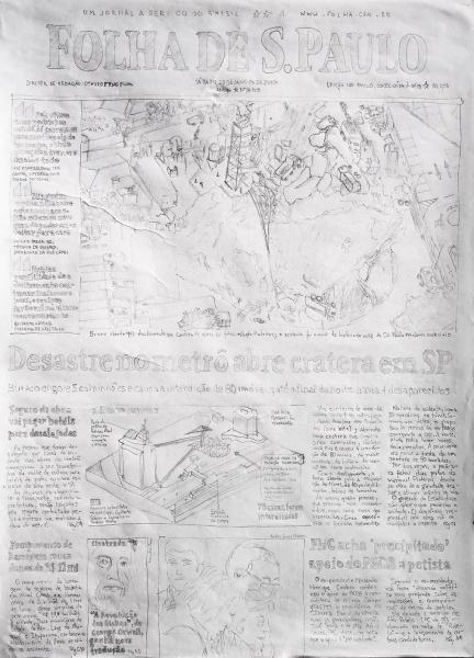
Statement
In this image there are two elements which are a clear allusion to what I intended to convey: first it is handmade, second, and this might not be so clear to those who do not live in Brazil or, even, São Paulo, it represents the cover of a very big local newspaper. Given these two elements, the possible unfolding can already be envisioned pretty clearly, especially because it is being presented in this space. (I want to make it clear that there was no intention to bring up the specific subjects of the particular edition of the newspaper I chose.)
This being a handmade drawing addresses the complicated, and often dualistically simplified, relations between humans and machines and the creations sprouted from these relations. More specifically those mediated entirely by computers as opposed to those which are mediated by tangible mediums, in this case: blogs vs. newspapers (or periodicals in general). In this specific context it is particularly important to mention the facts that blogs are created by ordinary people, are often biased and, more than anything, are usually open to discussion. Thus, blogs tend to promote direct relations, but, at the same time, they are presented in a medium which has not been entirely incorporated in most people’s lives, which introduces a certain limitation to these interactions.
Newspapers, on the other hand, are almost everywhere and they don’t provide direct communication channels (between readers and writers). Maybe because of this they have acquired an almost super-human status, dictating what/how/when one should think. With all its seriousness, given by both the way it is shown to us and by the “important” themes it presents, a newspaper seems formal and entirely machine-made, with the intention to disclose some sort of absolute truth. It has to convince the reader that it is worth reading (this has, of course, origins in the fact that newspapers are also commodities). But the interplay between the importance of what is presented and the fact that we know that newspapers are, ultimately, expressions of human thought is exactly what paves way to its deconstruction: it easily becomes obvious that newspapers are also biased, they are, as much as blogs, the products of whoever makes them. Newspapers carry the contradiction between their proposal (evidencing facts) and the means to reach it (an analysis of reality carried out by humans).
A contradiction which is, for obvious reasons, not clearly evidenced by newspapers themselves: no newspaper would ever have an entirely handmade front cover. They could make it, and surely in a much more appealing way than I did, so it is not because of a technical difficulty, but because it would make no sense to do it. And this is another important aspect of the discussion I want to bring up: what are the things that make sense in a newspaper? What are the things that make sense in a blog? How do the techniques involved in the creation of each of these limit what they can present?
There is undeniable freedom in whatever topics are approached in a blog: there is no editor, there is no need to review content, there are practically no boundaries, there is no need to please anyone. Which is, the way I see it, an evidence of the selfishness of blogging; despite the fact that they are thought of as a means to bring people together. Not that newspapers aren’t like that, but it seems that newspapers are much more attached to an ideology, a corporate conduct that dictates a more or less strict path of thinking; in a sense newspapers express ‘collective selfishness’, they are concerned with what is important to all their readers/buyers.
When we compare newspapers and blogs, a big difference that comes up is that the latter are allowed to change, they are allowed to shift and modify their ideas as much as the writers are willing to (by running the risk of discrediting themselves). Blogs are fluid, they are changing, the very medium in which they are written allows for them to be modified in a way that newspapers can’t: once you commit and article to a newspaper the only way of going back is by writing another, but you can always change (and even delete) a blog post.
Because of all this, blogs force us to permanently question them, they bring doubt, and doubt is thought, independence. Instead of having a swarm of information thrown at you by a large chunk of paper, which you must incorporate and be ready to spill out in appropriate moments, you are required to make your own mind about what you (choose to) read and form your opinions. And, as much as reading newspapers has confused the way we read blogs, blogs are changing the way we read newspapers.
This very essay is an evidence of all this. For instance, in the third paragraph, when I state that newspapers “have acquired an almost super-human status, dictating what/how/when one should think (…) with the intention to disclose some sort of absolute truth” a series of questions emerge: in which context is this true? For whom? Is is true at all? I am not entirely sure myself (which leads us back to the conclusions in paragraph six).
Thus, by presenting, on a blog, a handmade image of a newspaper we are exposed to a series of questions and contradictions between the forms and mediums in which all of these three elements exist and are expressed, requiring us to (re)evaluate them.
Even higher resolution image here.
[Some of these ideas or related, have already been discussed elsewhere from a different angle]
rhwinter, March 23rd, 2007
Filed under: art, meta
2 Comments
|
|
|
|
| Vladimir Dubissarsky & Alexander Vinogradov, who make contemporary art, just like |
 |
Franz Ackermann, who is German, just like |
 |
 |
|
|
Adolf Hitler, who was a vegetarian, just like |
| Andrei Tarkovsky, who was Russian, just like |
|
|
 |
 |
|
|
The Dalai Lama, who is a religious leader, just like |
| Béla Tarr, who makes movies nobody seems to understand, just like |
|
|
 |
 |
|
|
Pope John Paul II, who spoke Spanish, just like |
| Amon Tobin, who contributed to recent Hungarian cinematography, just like |
 |
Alex Trochut, who does not have a name that seems to be from where he is, just like |
 |
|
|
|
|
rhwinter, February 10th, 2007
Filed under: art, cinema, circular, music, type
No comments
I know that most people out there are not really interested in printing pages from the internets. But hey, some of us are! The main problem you find when trying to print pages is: they (usually) are not meant to be printed! In comes Firefox and its add-ons. More specifically: the Web Developer Firefox add-on. With it you can (among a million other things) change a page’s look by altering its CSS. Ok, this tip is not going to work for everyone, but if you do know CSS, a little bit might go a long way to help you save paper and your poor eyes: the changes you make on the CSS using Web Developer are taken into account when a webpage is printed!
An example: this interview with Jonathan Barnbrook really got me interested and I wanted to print it. It takes just a quick look at the page to realize it will look bad when printed. More specifically, it’ll look like this:
You can see how the font is really really small and a lot of prrrecious paper is being wasted (the article spans 7 printed pages). Now just fire up the ‘Edit CSS’ feature on Web Developer (under Tools-> Web Developer-> CSS). At the end of the code shown on the newly opened sidebar type something like:
* {
background: white;
font-size:12.5pt;
}
table {
width:100%;
}
i {
font-family:Georgia;
font-size:16pt;
font-style:normal;
font-weight:bold;
}
.bodytext{
font-family:Georgia;
font-weight:bold;
}
p{
text-align:justify;
font-family: Times New Roman;
margin:0;
padding:0;
margin-top:0.5em;
line-height:1.5em;
text-indent:25px;
font-weight:normal;
}
.headings {
font-size:24pt;
}
And you’ll get is this:
Notice how fonts are larger, changed and much more readable when printed. All the wasted space is gone and, despite the fact that the printed article still amounts to 7 pages, we are not wasting paper: it is actually being used to improve readability (you could have used smaller “line-height” so that lines are not so far apart; you could also use smaller fonts). And that was just a quick dirty edit of the CSS, the more you want it to look good, the further you’ll get.
Another trick worth mentioning is: if a page has lots of links and you don’t want them to be stupid blue text you can actually write the link address after the linked word, simply use this nifty css rule:
A:after {
/* Expand URLs for printing */
content:” (” attr(href) “) “;
text-decoration:none;
}
See how this:
Magically turns into this:
Hope this was useful.
rhwinter, February 5th, 2007
Filed under: css, firefox, code
2 Comments
Non-Format “is a creative team comprising Kjell Ekhorn (Norwegian) and Jon Forss (British). They work on a range of projects including art direction, design and illustration for music industry, arts & culture, fashion and advertising clients. They also art directed the monthly music magazine The Wire between 2001 and 2005“.
Indeed the amount of work they do is incredible, and in all possible fronts. So, no matter your taste, you’ll probably end up finding something you like in their site (which is not necessarily good, nor bad). Some highlights:
They do work with television:

Create different styles of types:

And more:

This last one is simply great, especially considering they call themselves designers (or do they?):

Mind that this is just a small sample. They also have works related to: interior design, packaging, outdoors, exhibits, catalogues, websites, folders, magazines, photography… For more: http://www.non-format.com/ (the only bad thing about it is the amount of ads you end up seeing).
rhwinter, February 1st, 2007
Filed under: design, type
No comments
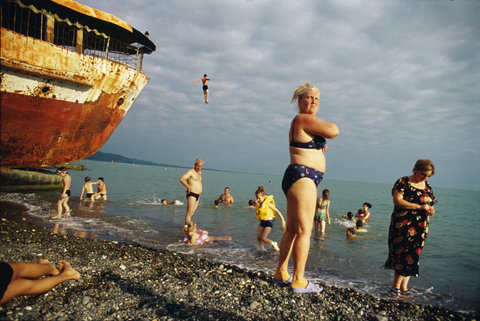
At a glance you could say that Norwegian photographer Jonas Bendiksen has a more “traditional” approach to photography than the others featured here before.
But, sometimes, these things come up…
And that is exactly what draws and fascinates me s about his work: it is carried out in a frontier. He creates pieces which can be considered “good” or “correct” under the most traditional terms of photography (such as exposure, framing, color, light, etc) and, at the same time, presents some which are a bit more “challenging” and related to trends of the so-called contemporary photography (or those in which photographs themselves are the subjects).
What is even more striking is that he does it all in a meaningful way and within the scope of his own work, that is, it all seems to make a lot of sense so that when you see one of his images you almost “know” it really is his.
More Links
rhwinter, January 25th, 2007
Filed under: photo
1 Comment
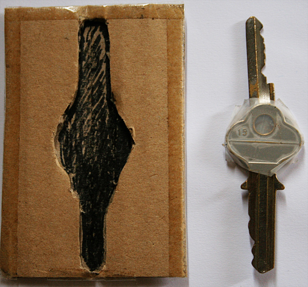
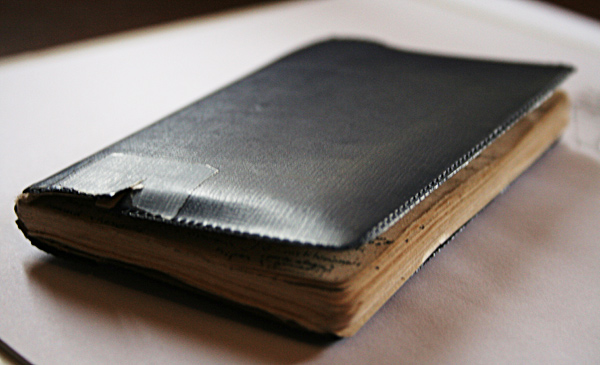
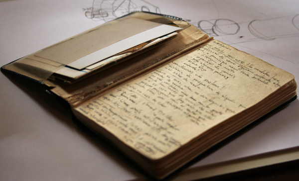
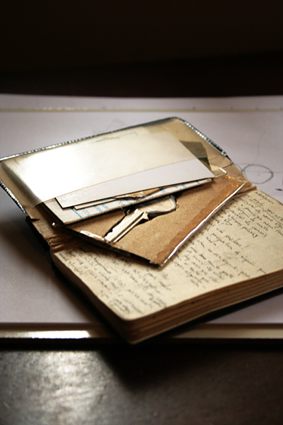
I have this problem with keychains: they are usually too bulky and, worst of all, they make an annoying tingling noise. That is why I decided to make a keychain myself. After a long period of intense research looking for the right material, techniques and design (yeah, as if!) I came up with a solution.
You see, I carry my wallet/notebok (image above) around with me all the time, so I thought my keychain should somehow be there all the time.
This wallet-thing has compartments for cards and whatnot. So I made a card-keychain.
The thing is very simple and easy to make with a small piece of cardboard and a knife. First you’ll want to make your keys become 2D, or stick them together so that they stay horizontal relative to one a nother. Then cut the shapes of the keys throught the first and middle layers of the cardboard making sure not pierce throught the third one (the other side). Finally remove the middle layer from the inside of the cut area. And that’s it! I added some scotch tape on the sides to make it more rugged.
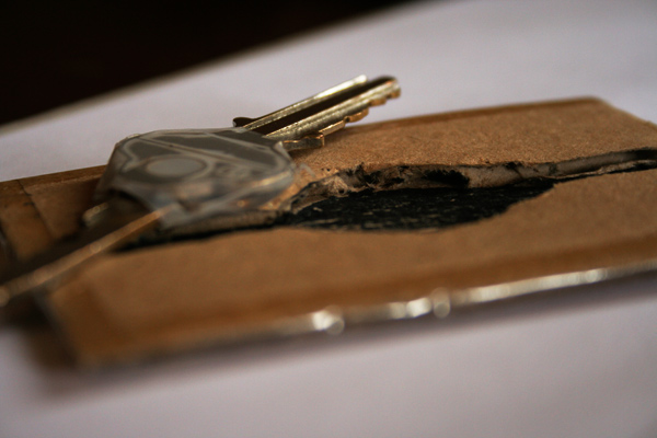
All in all it works, but there are some problems with the current “prototype”, those are:
- the shape of the keys was excessively precise, now I can only fit them in one exact position; next time: make the shape fit the keys in all 4 possible positions
- the cardboard was cut too smal and the keys didn’t fit right; next time: shape the keys before cutting out the card-size cardboard
- it is rather inconvenient because it requires you to use both hands to get a key; next time: try something different, maybe more like swiss army knife type of thing.
If you have any other ideas or solutions on how to solve this problem that afflicts mankind, don’t hesitate: comment here!
rhwinter, January 20th, 2007
Filed under: DIY
2 Comments
Or is it? “Noise” is going analog for the next few weeks, which means I won’t be able to post for some time. But don’t despair: I wrote some things which are scheduled to be automatically published!!! (I’m not sure it will work, but…)
During this time I won’t be able to approve/reply comments either, but don’t let that stop you from commenting: as soon as I come back I’ll sort them all through.
So, don’t remove “Noise” from your readers, lines, buckets, reddits, boxes, rojos, etc just yet!
rhwinter, January 19th, 2007
Filed under: meta
No comments


